
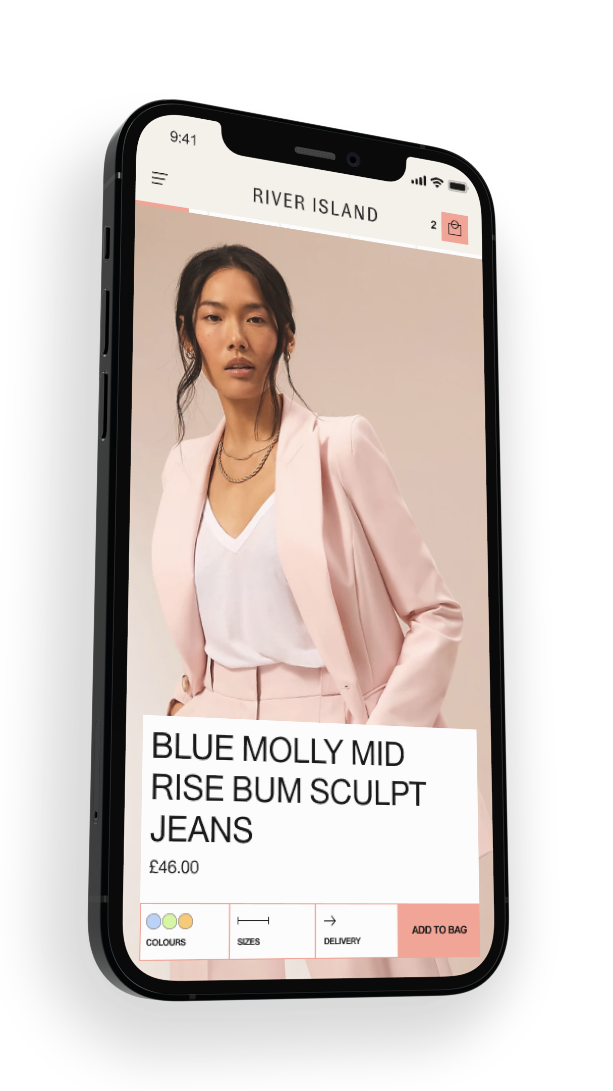
Product Page
River Island - 2022
The Need
The Inspire & Browse tribe have been slowly upgrading pages of the website to micro front-ends, and it was our most important page's turn...
The project
Journey analysisUX AuditRebrandOptimisationPage redesign
The core team
Olly Boon (Senior UX Designer)Mustafa Gokeri (UX Designer)Jacob Brown (UX Designer)
The problem
Years of tests had created a Frankenstein's monster with no cohesive journey for the customer, leaving a fragmented page with multiple competing business goals.

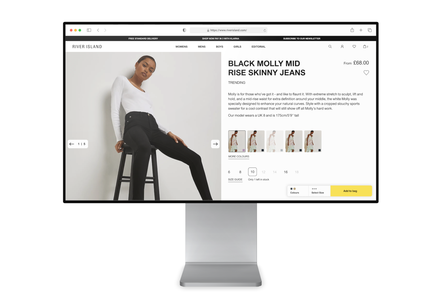
Previous product page (V2.0)
The Goal
Bring back the focus to the product and give River Island customers the information they need to have the confidence to make an online purchase
Insights
Research
Changing the way we evaluated our data in order to prioritise the new product page's feature set
With the pandemic shifting the business priorities, the Inspire & Browse tribe’s focus had become optimisation. We had become reliant on quick usability tests and focusing on the quantitative data we got from our live MVTs. As the lead designer for the tribe, I wanted to focus on the interplay between our data sources when redesigning the page and its modules.
ANALYTICS
CUSTOMER INTERVIEWS
MULTI-VARIANT TESTS
USABILITY TESTS
Anatomy of the product page
Only 26% of page real estate dedicated to the product
Page interaction
Reviewing our analytics highlighted some key insights and pain points
- Both converting and non-converting customers were not likely to scroll past the product details.
- The image gallery is a common cause of frustration due to a lack of control and zooming.
- Size selection takes 13+ seconds of consideration.
- Core product information not easy to access.
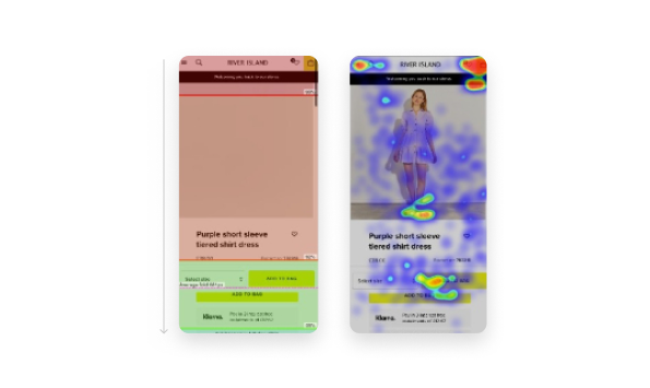
User scrolling and page interaction
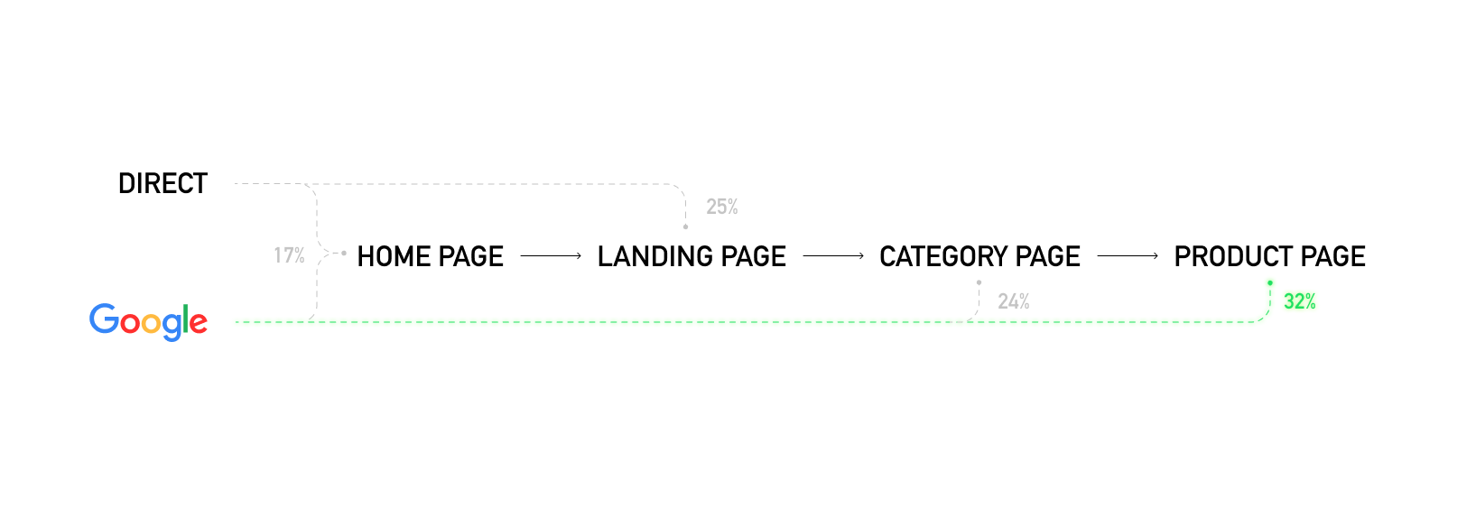
Context
User journeys
There are multiple customer journeys to consider, but my main consideration was the continuously growing segment of customers landing directly on our product pages.

Previous product page (V2.0)
Customer interviews
Customers are very likely to bounce from the page after reviewing minimal information about the product
- The core functions (size, colour variants, product imagery) must be easily accessible.
- The customers will make split-second decisions based entirely on the first product image.
- Most customers will only look for cross-selling products if they had already intended to shop at River Island.
Persuasion to inspiration
Redefining the business goals and assigning new KPIs to the page and its components.
Add to bagConversionBrowse time
Add to bag and conversion rates were a more straightforward problem to tackle, with our comprehensive list of pain points. Some minor tweaks to the product page UI could drastically reduce friction when deciding to purchase a product. However, Browse time had many factors that affect it. I found a missed opportunity across a few of our customer segments who are looking for product and outfit inspiration. These customers were bouncing off our product page due to lack of information, imagery and outfit inspiration. These same customers were also deterred by the way we present information such as delivery cut-offs and social proof messages.
Exploration
Early stage concept of PDP 3.0
Exploration
Creating a product page experience that can adapt to the customer journey
- Only show components that are relevant to the journey.
- Order the page components to prioritise useful information and inspiring products.
- Provide more information about the product.
challenges
Usability vs brand
Conducting another round of unmoderated usability tests, I found that injecting too much branded design into the page made it difficult for the customers to find key product information. I shifted the look of the page to make the product info section ‘sacred’, allowing minimal brand expression in favour of simplicity and usability.
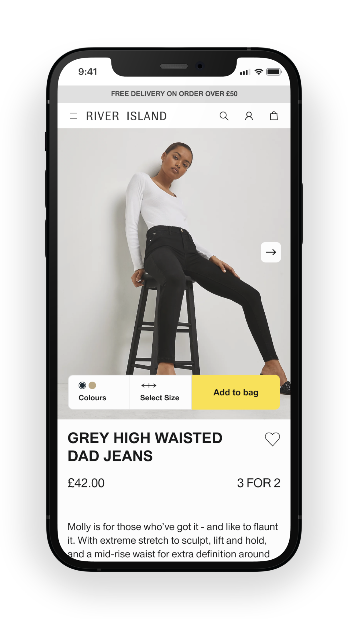
Final product page (v3.0)
Build strategy
Final build
Major improvements
With our Product Manager, I prioritised the updates that provided solutions to our most common pain points in the first release of our version 3.0 product page.
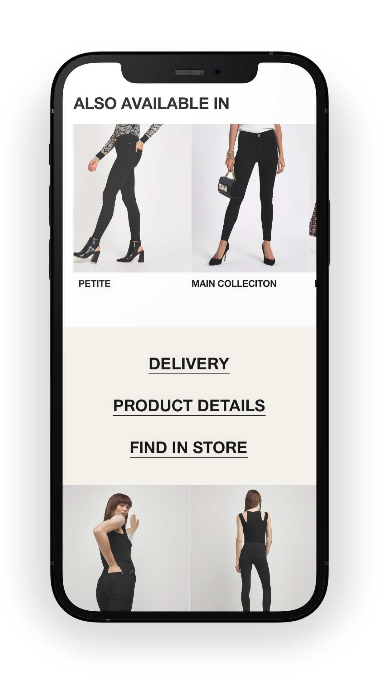
Sticky add to bag, colour and sizeShowcase more user-generated contentUrgency messaging tone of voiceImage thumbnail colour swatchModular adaptive layoutIn-page highlight galleryOccasion based outfit recommendations
continuous improvements
Feeding the backlog
Version 3.1 and onwards would begin to include some features that I believed needed further validation. These would be added to the continuous improvements backlog and tested post-release of version 3.0.
Image gallery navigation arrowsProduct info reformatImage gallery zoomShow fit typesIncrease number of visible recommendationsCategory navigationimproved similar item suggestion
Results
For our customer segment in need of inspiration, we increased page browse time by 15 seconds. Increasing conversion rate by 2% for the same customer segment.
Challanges
Considering the many journeys and entry points and selecting the biggest opportunity area.
Helping craft a realistic development backlog that wouldn’t lead to a fractured experience.
What's next?
Further optimisation within the modular framework. Focus on other user journeys (e.g. Pay per click)