
Product shortlisting. Refined
Product shortlisting. Refined
Mini bag
The Problem
Our users do not get the results they need from our wishlist functionality. They are more likely to abandon products and not convert. We had been following the design norms and not asking ourselves what our customers really want from the wishlist and bag when they are shopping.
How might we improve the product shortlisting experience for our customers? ❤️
How might we improve the product shortlisting experience for our customers? ❤️
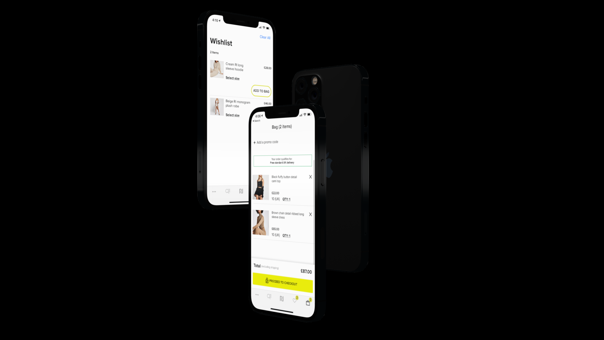
2020 RI App Wishlist and Bag screens
Research methodology
We required a combination of qualitative and quantitative metrics to fully understand the problem.
CUSTOMER INTERVIEWS
ANALYTICS
IN-APP SURVEY
ITERATIVE PROTOTYPING
Shortlisting in the bag
The interviews with our customers highlighted the key benefits of using the bag instead of the wishlist.
user behaviour
Bag vs Wishlist
The users could see a running total of their list in the bag, but not in the wishlist
The bag layout is consistent across most retailers so the customers were confident in using the available features.
With initial research in the form of user interviews and an in-app survey we found our users were less likely to use the wishlist functionality in the app for list building purposes. Generally the customer was more comfortable adding products they liked to the bag and reviewing their list at the end of their session. They would most likely take a screenshot to remember products they like (or to share them).

Current app wishlist
Analysis
With the feedback from our user interviews and in-app survey we could see that list building is important for mobile customers. Our customers were more comfortable using the bag to shortlist products because UI is fairly consistent across retailers. Although our wishlist does need refinement it was clear that we should prioritise optimising the bag UI due to it being the first port of call when our customers are shortlisting products.
What do our customers want?
Bag item count (How many products have I saved?)
Running total (How much am I spending?)
Ease of access (I like to review my shortlist often)

Exploration
Initially, I wanted to prioritise ease of access to the bag. Here I wanted to explore the idea of a true mini-bag that was able to showcase the contents of the bag no matter where the customer is in the app. This concept was an intentional break from the traditional UI patterns used by other retailers. Would providing something entirely different help or hinder our users ability to complete their goals?
A round of usability testing with our customers showed the concept was too far removed from a traditional tab bar. Some customers commented they would rather see a bag count than the actual products, and that the products in the mini bag bar were a distraction.

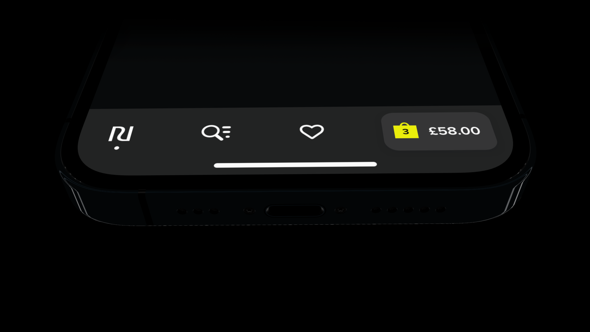
Solution
The solution we landed on after 3 rounds of usability tests was an integrated mini bag that provides clear visual feedback when adding products to the bag, as well as product count and running total. This allows the app user to navigate around more like a traditional app but provides the extra information that is normally hidden behind a tab switch that often disrupts the journey.
Results
Our live tests showed an increased average bag size of +1 product, and indirectly caused a higher utilisation of the Wishlist. Follow up customer interviews highlighted the Mini Bag’s success in getting our customers to meet the minimum threshold for free delivery through the persistent bag total display.
Challanges
With an initial goal of improving our Wishlist functionality it was a challenge to get the team and our stakeholders to consider options that didn’t directly contribute to the Wishlist backlog. However, by shifting our priorities the Mini Bag tests increased the number of “Move To Wishlist” actions in the bag by 2X.
What's next?
As part of a future thinking exercise the Mini Bag feature is now in build. After launch I will attempt to understand its pain points and iterate on the concept for implementation on the River Island website.